I. Introduction
If you work with data, chances are you’ve come across pie charts. This circular chart is an effective way to illustrate data points and is commonly used in presentations, reports, and other communications. In this article, we’ll explore how to make a pie chart in Excel, step-by-step, and provide tips for maximizing your data and creating visually appealing charts.
II. “Easy Steps to Create a Pie Chart in Excel”
Creating a pie chart in Excel is relatively simple, and it only takes a few clicks to create a basic chart. Here are the steps:
- Select the data you want to include in the chart.
- Click on the “Insert” tab and select “Pie” from the chart menu.
- Select the type of pie chart you want to create (e.g., 2D or 3D).
- Excel will create a basic chart. From here, you can customize the chart title, labels, and more.
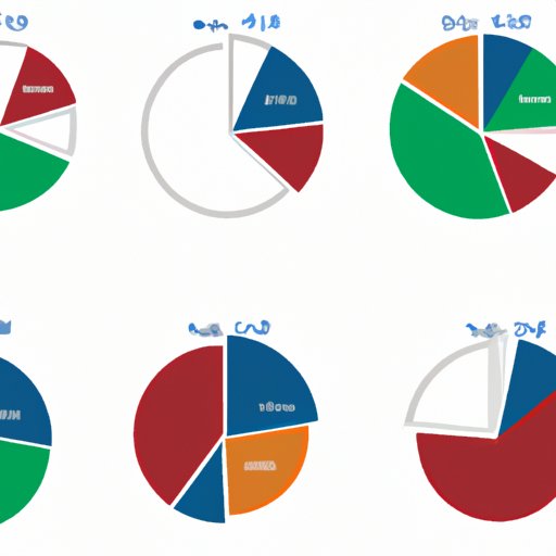
It’s important to note that there are several different chart types you can choose from, including doughnut charts, exploded pie charts, and more. Each chart type is best suited for specific data presentation needs. For example, an exploded pie chart is useful if you want to emphasize a particular data point. Take some time to explore each chart type to determine which one is best for your needs.
III. “Maximizing Your Data with Pie Charts in Excel”
While pie charts are useful on their own, they can be even more effective when used in conjunction with other data visualization tools. Here are some tips for maximizing your data with pie charts in Excel:
- Add labels: Excel automatically labels pie charts with data point percentages, but you can also add custom labels to provide more context.
- Change colors: Customize the colors of the chart to make it more visually appealing and help highlight points of interest.
- Customize the style: Excel offers a range of customization options, including label position, chart title, and more. Play around with these options to find the best style for your data.
It’s also important to note that pie charts may not always be the best option. For example, if you have a large dataset or are trying to show trends over time, a line chart or stacked bar chart may be a better choice. Keep your data presentation needs in mind when selecting the appropriate chart type.
IV. “Beautiful Pie Charts Made Simple in Excel”
While pie charts can be effective on their own, a visually appealing chart can make all the difference in communicating your data effectively. Here are some tips for making beautiful pie charts:
- Use formatting tools: Excel offers a range of formatting tools that can help you create a more visually appealing chart. For example, adding a gradient fill to the chart can make it more visually interesting.
- Use color: Select colors that complement the data and make the chart easy to read. Avoid using too many colors, as this can make the chart confusing.
- Play with fonts: Changing the font of the chart title and labels can make the chart more visually interesting. However, be sure to choose a font that is easy to read.
By using these design elements, you can create a pie chart that is both informative and visually striking.
V. “Mastering Pie Charts: Tips from Excel Pros”
Excel is a powerful tool, and there are many features that can help you create more complex pie charts. Here are some tips from Excel pros:
- Explode the chart: An exploded pie chart can help highlight a particular data point. To do this, select the chart and right-click on the data point you want to explode. Select “Format Data Point,” and then drag the “Explode” slider.
- Group smaller slices: If you have several small data points, it can be difficult to read the chart. You can group these slices together by selecting them and choosing “Group Selection” from the “Format” menu.
- Add a trendline: If you want to show trends over time, you can add a trendline to the chart. To do this, select the chart and choose “Add Trendline” from the “Chart Design” menu.
By using these features, you can create more complex charts that effectively illustrate your data.
VI. “Using Pie Charts to Tell Your Data Story”
Finally, pie charts can be used to create a compelling narrative around your data. Here are some tips for using pie charts to tell your data story:
- Add annotations: Annotations can help provide context and tell a story around the data. You can add annotations by selecting the chart and choosing “Add Chart Element” from the “Chart Design” menu.
- Show multiple charts: If you have multiple data points or want to show trends over time, consider including multiple pie charts in the same chart. This can effectively illustrate your data and make it easy to understand.
- Use a title that tells a story: A title can make all the difference in communicating your data effectively. Choose a title that effectively summarizes your data and tells a story.
By using these tips, you can create a pie chart that effectively tells the story of your data.
VII. Conclusion
In conclusion, a pie chart is an effective way to represent data. By following these easy steps and utilizing the tips for maximizing your data, beautiful pie charts, mastering pie charts and using them to tell your data story, you can create charts that are both informative and visually appealing. Remember, selecting the appropriate chart type based on your data presentation needs is key to creating effective charts that tell the story of your data.