Introduction
In statistics, frequency is the number of times an event occurs in a data set. Whether you’re analyzing survey results, business data, or scientific research, being able to calculate frequency is essential to understanding patterns and drawing insights. This article will guide you through the basics of calculating frequency, from simple hand calculations to using Microsoft Excel, and provide practical tips and examples for interpreting and analyzing frequency data.
Mastering the Basics: A Guide to Calculating Frequency in Statistics
Frequency is defined as the number of times a specific event occurs in a data set. For example, if you are analyzing student test scores and the number of times each score appears in the data set, you are calculating frequency. Common terminology to describe frequency data includes the frequency distribution, which shows how often each score occurs in the data set, and the frequency table, which displays the frequency distribution in a tabular format.
To calculate frequency by hand, you can start by creating a tally chart to count the number of times each event occurs. For example, if you are analyzing the number of times each letter appears in a sentence, you can create a tally chart like this:

Using this tally chart, you can calculate frequency by counting the number of tallies associated with each letter. In this example, the letter “e” occurs four times, so its frequency is four.
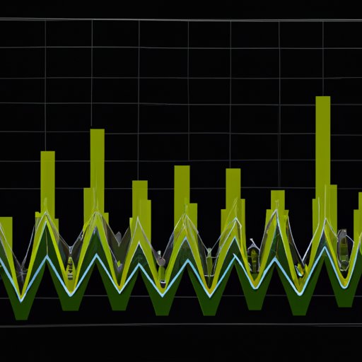
Another way to interpret frequency data is by using a visual representation, such as a histogram or bar graph. A histogram is a graph that displays the frequency distribution of a data set using contiguous bars, whereas a bar graph is a chart that represents data with rectangular bars with lengths proportional to the values that they represent. Histograms and bar graphs make it easier to see the pattern of occurrences and how often a given event appears in the data set.
From Raw Data to Insights: Understanding Frequency Distribution with Ease
A frequency distribution is a graphical or tabular representation of a set of data and describes the frequency of frequencies, frequencies of frequencies, frequencies of frequencies of frequencies, and so on. Frequency distributions are useful for summarizing and understanding large datasets. To create a frequency distribution table, you must first determine the range of values in the data set, calculate the frequencies for each value, and finally organize the data in a table format.
There are two types of frequency distribution, ungrouped and grouped frequency distributions. An ungrouped frequency distribution is created by listing all possible values in a data set along with their frequencies. A grouped frequency distribution is created by grouping the data into intervals and counting the frequency of intervals rather than individual values.
To analyze and interpret frequency distributions, you can use measures like the mode, median, and mean to describe the central tendency of the data. A mode is the most frequent value in a data set, whereas the median is the middle value of a data set, and the mean is the average of all values in the data set. By analyzing these measures, you can understand the shape and distribution of your data set and identify important patterns and trends.
Get Ahead of the Game: Quick and Easy Tips to Calculate Frequency in Excel
Excel is a powerful tool that can simplify frequency calculations and data analysis. There are several built-in functions in Excel that can help you calculate frequency, including the COUNT function, which counts the number of cells in a range that contain numeric values, and the COUNTIF function, which counts the number of cells that meet a specific condition. The FREQUENCY function in Excel counts the number of values that are greater than or equal to the values in a given range.
You can use Excel to create frequency tables and histograms by using the PivotTable and PivotChart features, which allow you to summarize and analyze large data sets. First, select the data range that you want to analyze and create a new PivotTable. Then choose the variable that you want to create the frequency distribution for and drag it to the Rows or Columns box. Finally, choose the variable that you want to count and drag it to the Values box. You can also create a histogram by selecting the chart type “Histogram” in the Charts ribbon and selecting the data range that you want to analyze.
The Power of Frequency Analysis: Unlocking Hidden Patterns in Your Data
Frequency analysis is a powerful tool for identifying patterns and trends in large data sets. By analyzing frequency data using statistical software or Excel, you can identify outliers or anomalies that might otherwise go unnoticed, such as unusual customer behavior or unexpected trends in financial data.
Real-world examples of frequency analysis in action include analyzing search engine queries to identify popular topics, analyzing customer reviews to understand product sentiment, and analyzing sales data to identify the most profitable products or services.
Simplifying the Complex: Step-by-Step Guide to Understanding Frequency Tables
A frequency table is a tabular summary of data showing the frequency of various categories or intervals. It contains information on the number of occurrences for each category or interval. A cumulative frequency distribution is a distribution of cumulative frequencies that displays the total number of observations equal to or less than a given value, while relative frequency, which is a type of proportion, expresses each category’s frequency relative to the total number of observations.
To create a grouped frequency table, first, you need to define the intervals or ranges. Rather than reporting the exact frequency of a given value, you group the data into ranges, which helps to simplify the data and make it easier to interpret. Next, you must determine the frequency of each interval and then organize these intervals in a table format. A grouped frequency distribution can help identify the distribution of data, including outliers and skewed distributions.
Conclusion
Calculating frequency is essential for understanding patterns and insights in large data sets. Whether you are a statistician, researcher, or analyst, mastering the basics of frequency analysis can be a valuable skill to have. By understanding the key concepts and using practical tools and examples outlined in this article, you can improve your data analysis skills and unlock hidden insights in your data.
Remember to use frequency analysis wisely and with appropriate techniques, as it can be a powerful tool for uncovering and understanding patterns, trends, and relationships in your data. With resources such as Excel and statistical software at your fingertips, there has never been a better time to master the basics of frequency analysis.
Additional resources for further learning include online tutorials and courses, books on statistical analysis and frequency analysis, and forums where you can connect with other data analysts and share best practices.